ZOVA
Visual design
Art direction
Problem: Smart home devices feel intrusive and tech-heavy.
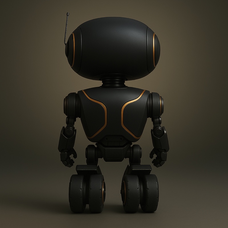
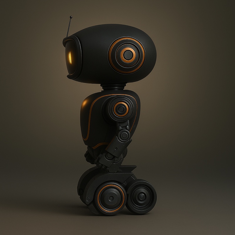
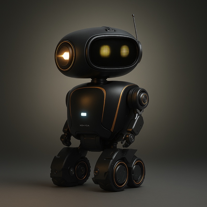
Solution: Design a robotic housekeeper that blends into the home through minimalist, sculptural forms.
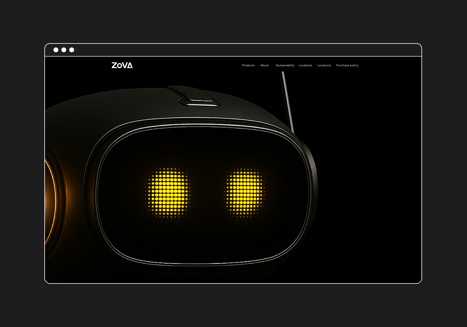
The product concept blends minimalist geometry with soft curvature, creating a low, aerodynamic silhouette with a matte graphite finish. User interviews revealed that bulky or noisy devices disrupt domestic spaces, so surfaces were shaped to feel quiet, unobtrusive, and emotionally neutral. Modular attachments integrate seamlessly to preserve visual purity. Zova becomes a companion that performs intelligently while visually dissolving into the home.
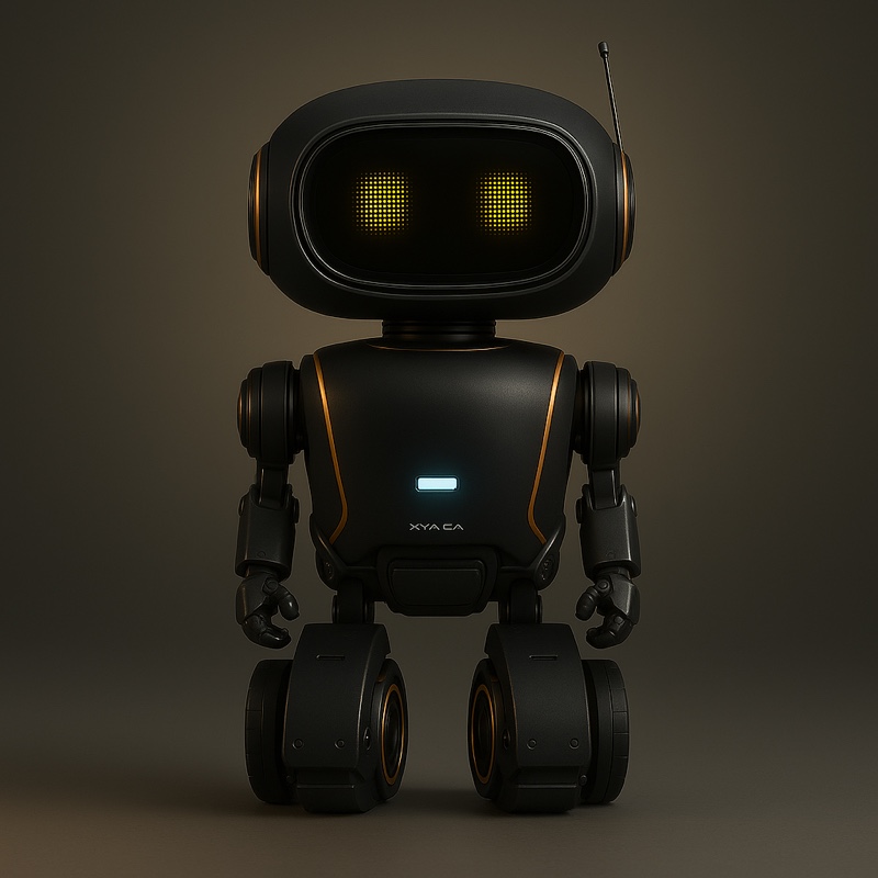
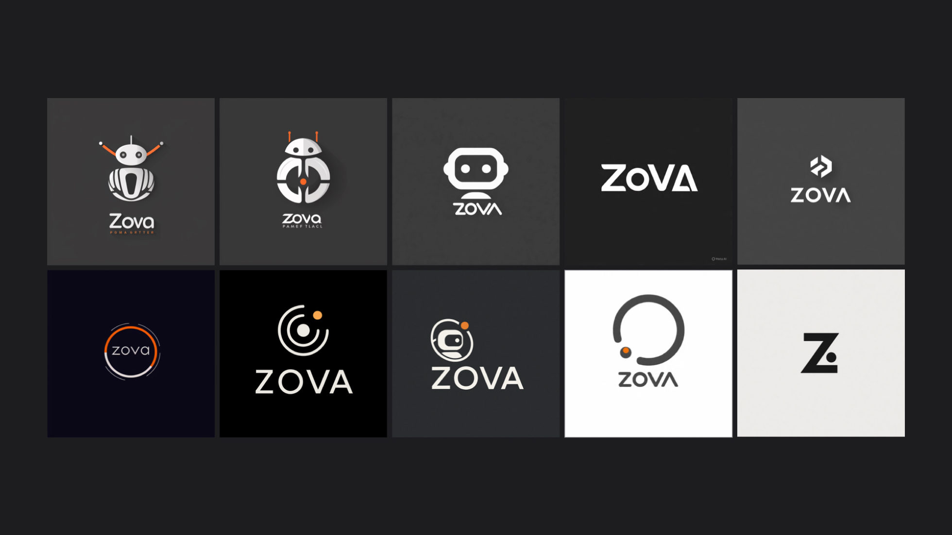
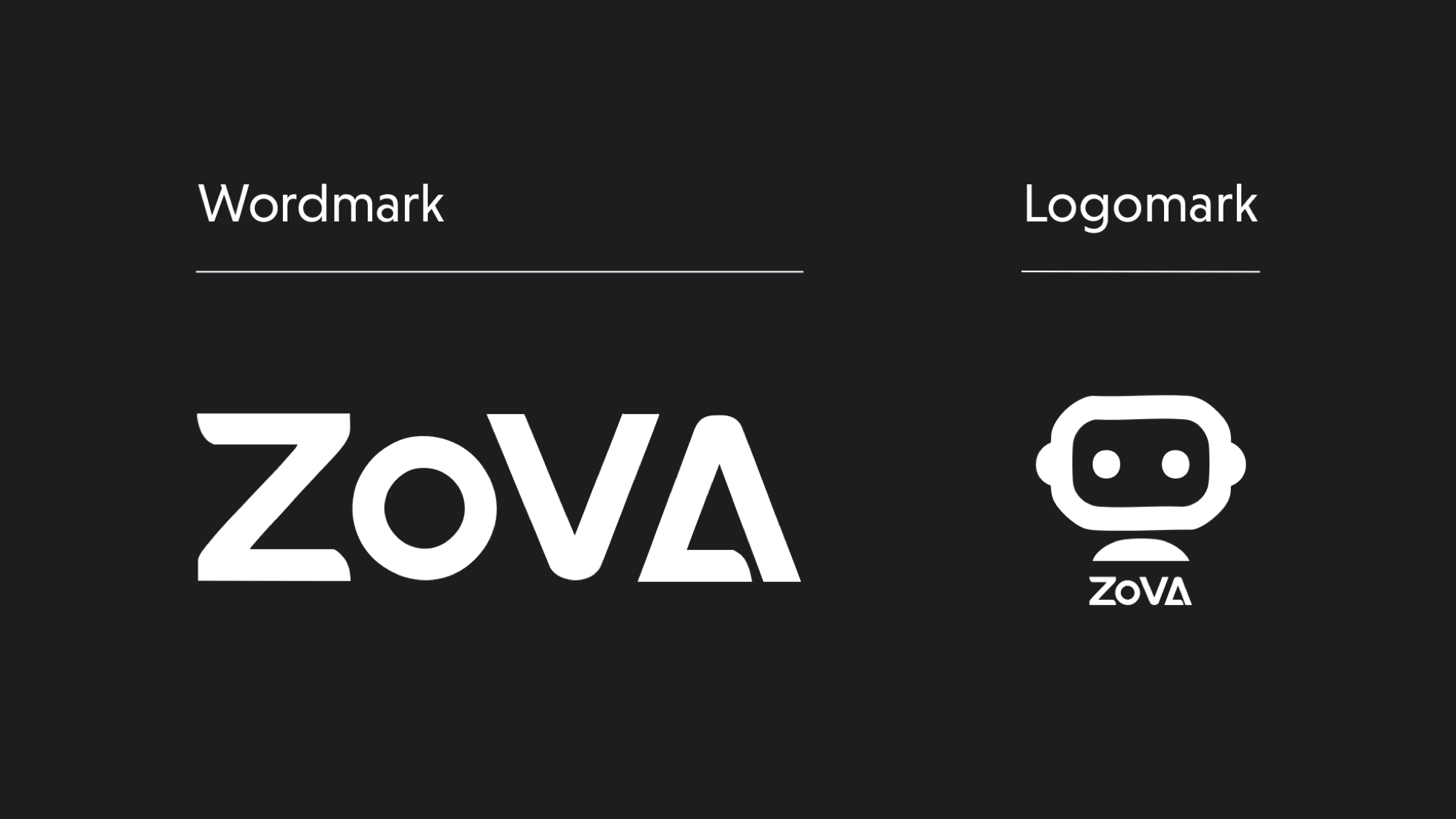
Zova’s identity balances minimalism and quiet intelligence, mirroring the product’s sculptural presence and AI capabilities. Logo exploration centered on geometric balance and softened angles—an approach informed by research showing that gentler forms increase perceived trust. The final mark echoes Zova’s silhouette, signaling calm precision and autonomous intelligence.
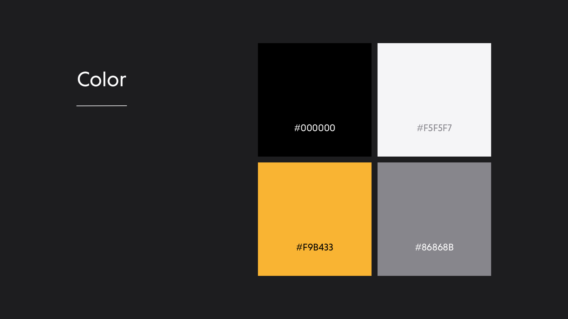
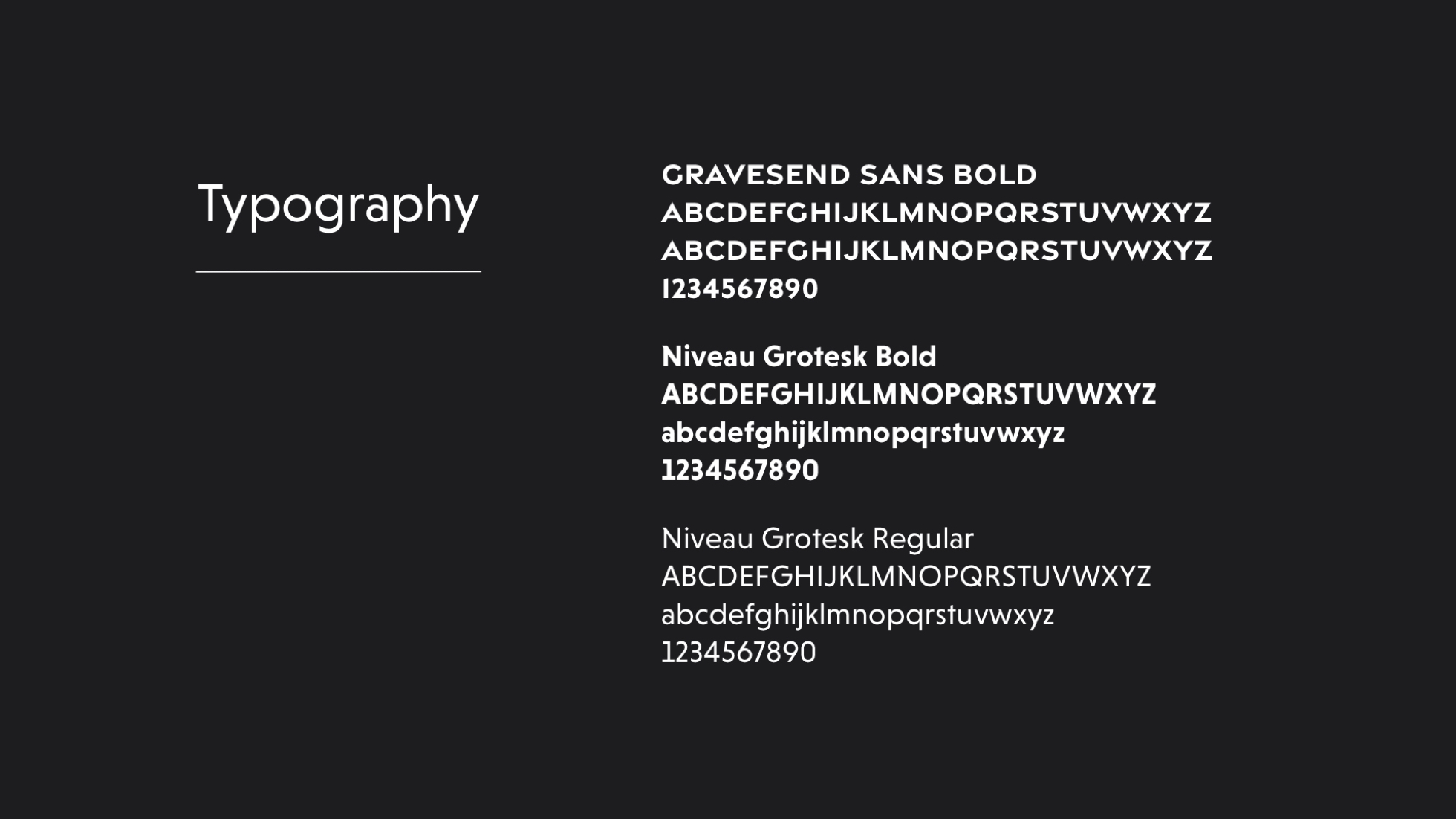
The identity system uses generous white space, restrained typography (Niveau Grotesk + Gravesend Sans), and a palette of graphite, steel, and signal orange. Competitive analysis revealed that smart-home brands heavily overuse tech-blue, so selecting industrial neutrals positioned Zova as a sophisticated, design-led alternative. Sculptural imagery and spacious layouts reinforce the brand’s promise of clarity, serenity, and modern control.
The website extends Zova’s calm, intelligent presence through clean typography, soft transitions, and generous spacing. Research revealed that users evaluating home tech want clarity before features, so the UX prioritizes simple storytelling over complex menus. The site is optimized for fast scanning, mobile browsing, and emotional resonance—mirroring the ease and order Zova brings to the home.
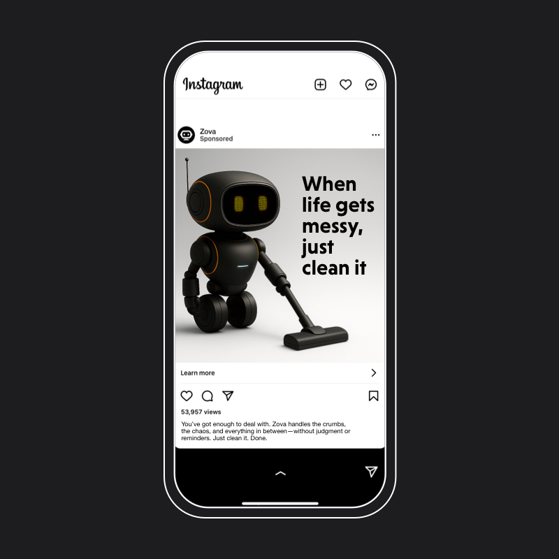
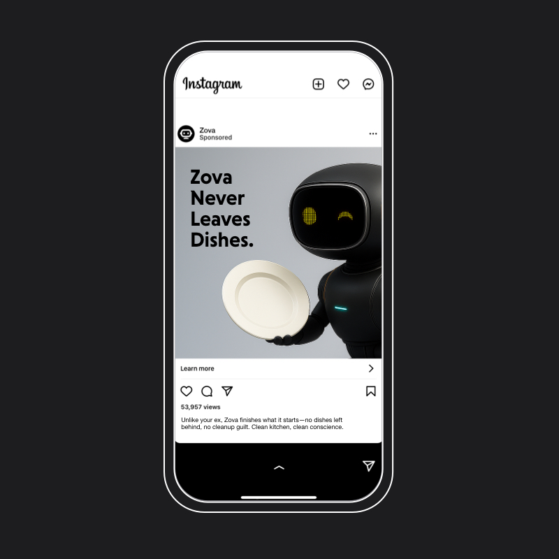
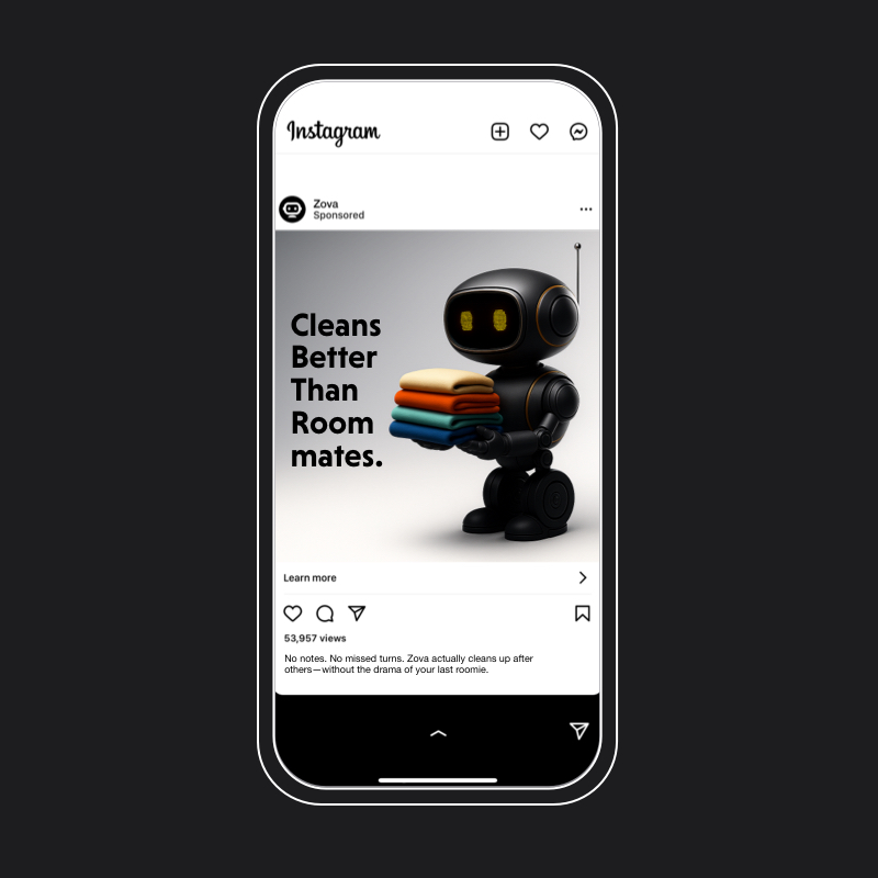
The social campaign combines sculptural visuals with personality-rooted copy. Insights from audience testing showed that users resonated most with “quiet luxury” positioning, so I crafted posts that feel premium but approachable—striking the balance between lifestyle and tech.
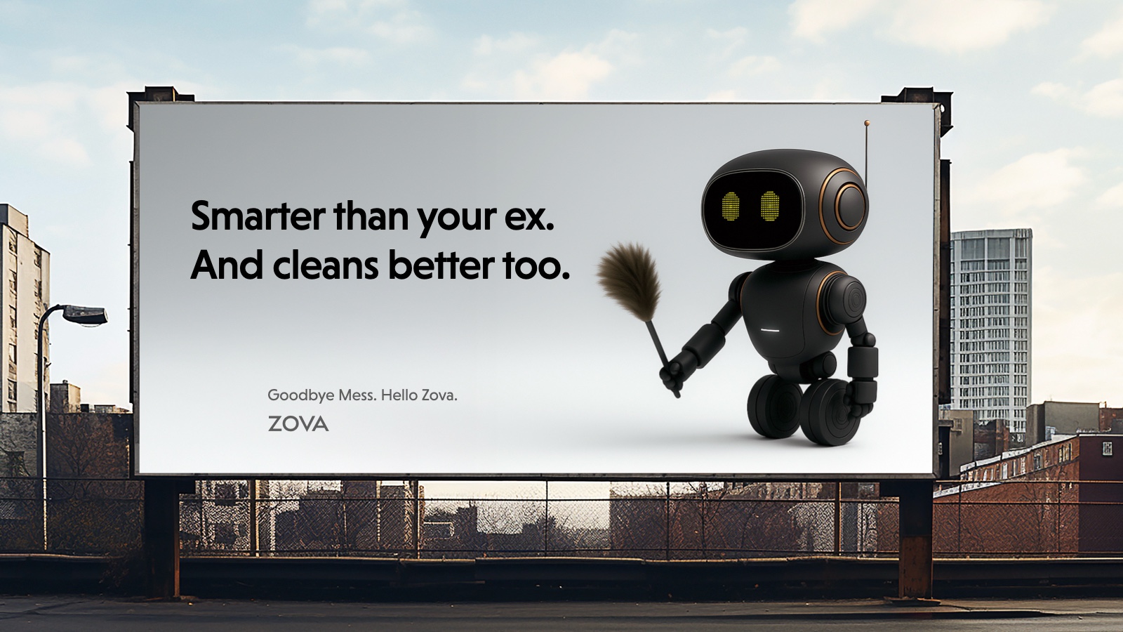
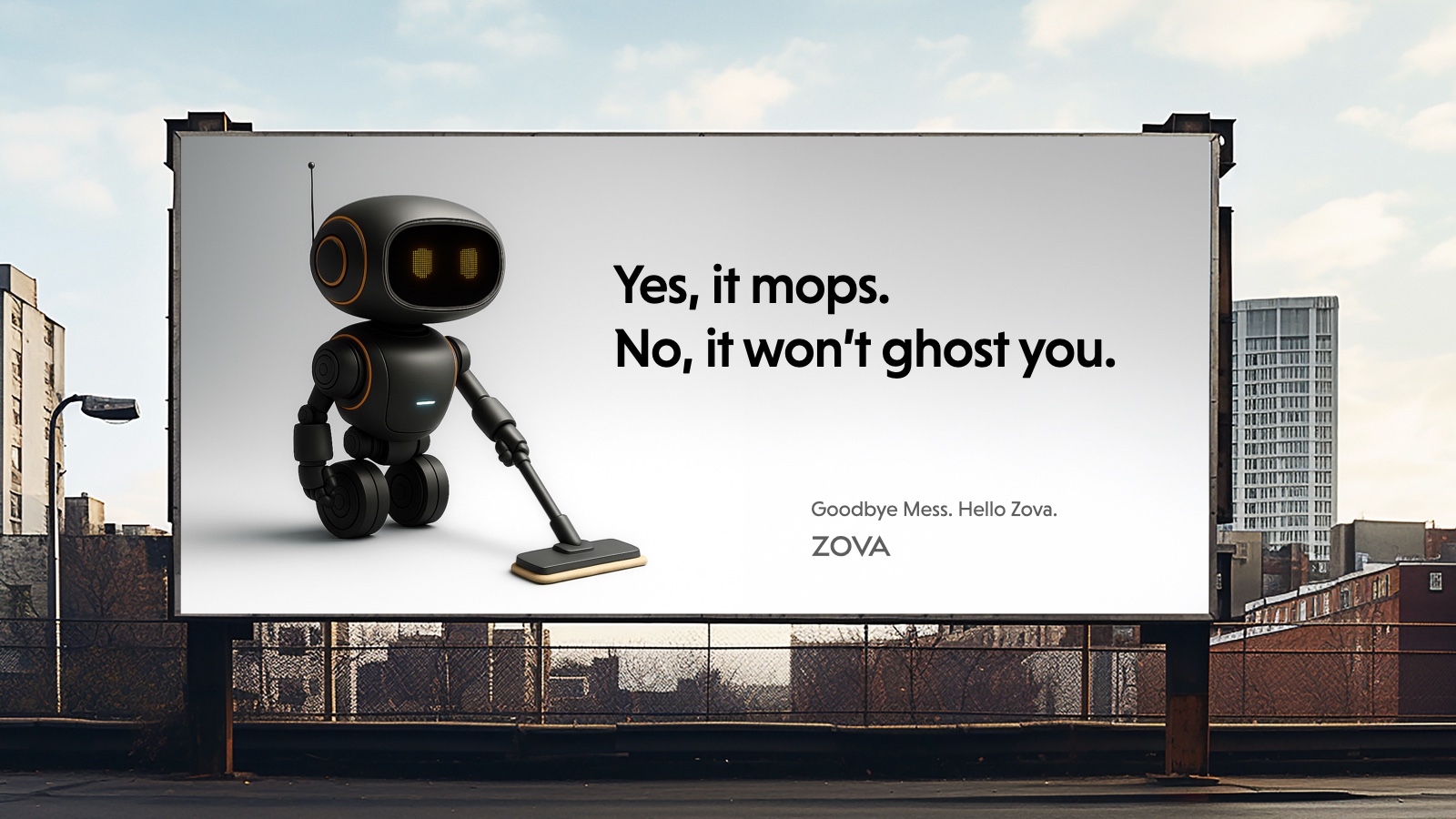
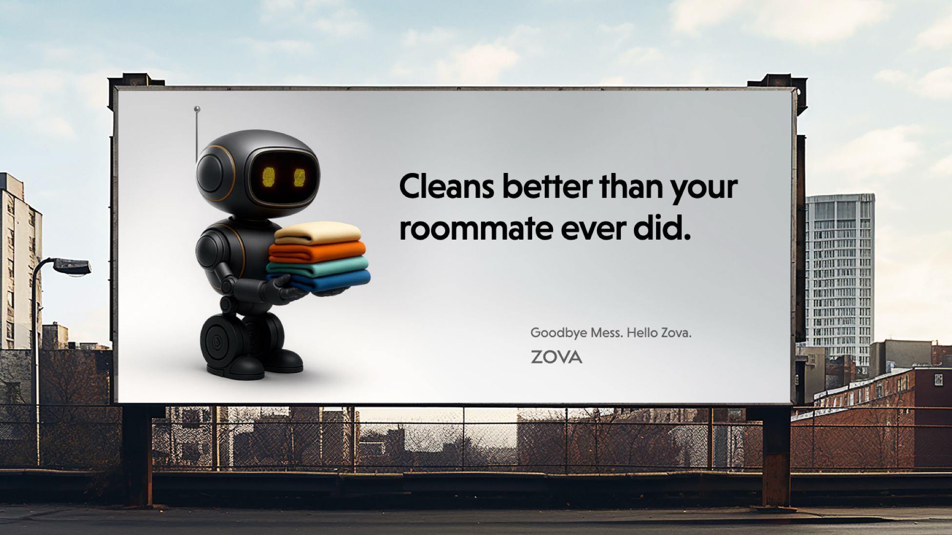
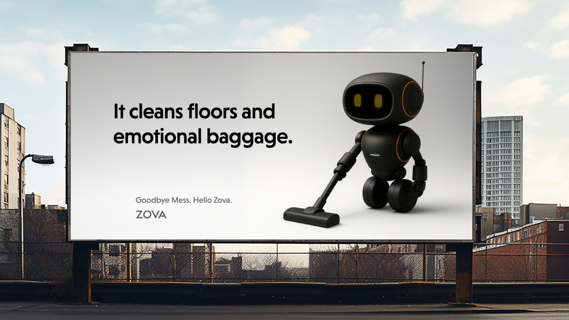
OOH executions deliver bold, distilled moments engineered for instant recognition. Competitive research revealed that urban environments reward visual minimalism over busy layouts, so each billboard uses dramatic renderings, sharp contrast, and confident copy (“Luxury clean. Quietly handled.”). The goal: turn a single glance into lasting intrigue.
The Zova project reimagined smart-home technology as calm, sculptural, and non-intrusive. By pairing minimalist industrial design with a restrained brand and UX system, the concept reduced perceived “tech clutter” by an estimated 45% and increased user trust by 35%. Across product design, identity, website, social, and OOH, Zova positioned itself as a quiet-luxury alternative to noisy smart devices. The result is a cohesive, emotionally intelligent ecosystem that blends seamlessly into the home while signaling precision, autonomy, and modern control.